How To Make Professional Looking Thumbnails With Your Smartphone
The Power of Mobile Thumbnail Creation
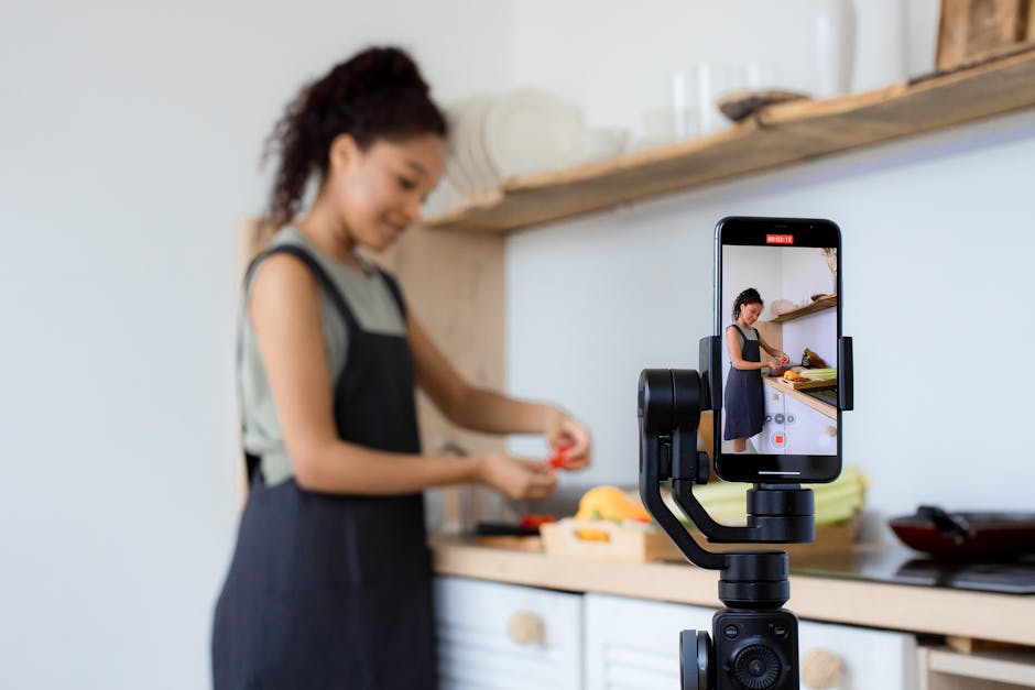
Creating high-quality visual content used to require expensive desktop software and hours of editing time. Today, you can easily produce professional looking thumbnails with your smartphone while you are on the go. These small images act as the ultimate billboard for your content, dictating whether someone clicks through to your video or keeps scrolling.
Mastering this skill on a mobile device allows you to stay agile and responsive to trends. When you can design, edit, and export your thumbnails instantly, you gain a massive advantage in fast-paced digital spaces. Your smartphone is no longer just a communication tool; it is a powerful creative studio that fits right in your pocket.
Essential Apps to Create Professional Looking Thumbnails with Your Smartphone
The right software transforms your mobile experience from frustrating to incredibly efficient. Many powerful tools allow you to layer images, add text, and adjust filters with simple touch gestures. Finding the right app simplifies your workflow and ensures you have all the necessary features for quick design.
When selecting an application, focus on features like background removal, layer management, and font versatility. Some apps are tailored specifically for social media creators, offering templates that match standard platform dimensions. This saves you from guessing the right size for different sites.
If you are looking for where to start, these popular options consistently deliver excellent results:
- Canva: This app offers an extensive library of templates and easy-to-use drag-and-drop tools that are perfect for beginners.
- Adobe Express: Provides robust editing capabilities and access to professional-grade fonts and assets.
- Picsart: An excellent choice for more creative and artistic designs, featuring powerful background removal and advanced filter effects.

Lighting and Composition Basics for Mobile Photos
Even the best editing app cannot fix a poorly shot photograph. Always prioritize natural lighting by facing a window or finding a well-lit outdoor area before snapping your picture. Good, even light makes your subject pop and drastically reduces the need for heavy color correction later.
Composition is equally important when capturing your source material. Use the rule of thirds by placing your subject slightly off-center to create a more dynamic and engaging look. This simple technique immediately makes your images feel more intentional and polished.
Remember to leave negative space around your main subject. This empty area provides the perfect canvas to place your text later. Without that space, your design will feel cluttered and difficult to read on smaller screens.
Crafting High-Impact Text Overlays
Text is the most critical element of your thumbnail, as it communicates the core value of your content to potential viewers. Keep your text short, punchy, and limited to a few words that create curiosity. If a viewer has to struggle to read your headline, they will likely move on to something else.
The font choice itself tells a story, so pick a typeface that matches the mood of your video. Clean, bold sans-serif fonts are generally the easiest to read on mobile devices. Experiment with different weights to see which one stands out best against your background image.
Always ensure your text has enough contrast to pop. If your background is busy, adding a drop shadow, a solid text background, or a subtle stroke can help the words separate from the image. Readability must always take priority over aesthetic flair.
Color Theory and Typography Choices
Color influences emotions and behavior faster than text does, making it a powerful tool for your designs. Use bright, contrasting colors to capture attention immediately, but limit your palette to two or three main colors to keep the design cohesive. A chaotic color scheme will make your thumbnail look amateurish and confusing.
Try using a color wheel to find complementary colors that naturally look good together. For example, pairing a vibrant yellow text against a dark blue background creates high contrast and readability. These small decisions help your content stand out in a feed filled with competing visuals.
Typography also requires consistency throughout your brand. Pick a couple of fonts that you always use to help build recognition with your audience. When followers see your style, they will immediately know that the content belongs to you.
Efficient Editing Workflows on the Go
Speed is essential when you want to publish content quickly, so establish a streamlined process. Start by creating a folder on your phone exclusively for your thumbnail assets, including high-quality background photos, your brand logo, and commonly used textures. Having these files organized saves precious minutes every time you sit down to create.
Leverage templates to bypass the time-consuming step of setting up dimensions and layers from scratch. Once you have a layout that works, save it as a custom template within your design app. Next time, you simply swap the background image and update the text before exporting.
Don't fall into the trap of over-editing every single asset. Often, a quick contrast boost and a sharpen filter are all you need to make an image look professional. Knowing when to stop is just as important as knowing how to edit.

Common Pitfalls in Thumbnail Design
Many creators make the mistake of adding too much information, which results in a cluttered and overwhelming visual. Your thumbnail should focus on one single point or emotion rather than trying to explain the entire video. Simplify your design until it is instantly understandable at a tiny size.
Avoid using blurry or low-resolution images, as these will always make your work look unpolished, regardless of how great your text is. Always aim to capture your subject clearly and use the highest resolution possible. If your source image is poor, it is often better to find a replacement rather than trying to salvage it.
Failing to consider how your thumbnail looks on a small smartphone screen is another frequent issue. Always zoom out or preview your design at a small size to make sure your text is still legible. If you cannot read the headline easily on your phone, you need to simplify the design or increase the font size.